Grays, Greens, Blues and Oranges- Oh My!
- Maria Bowers
- Oct 16, 2018
- 4 min read


Hey Everyone! Happy Fall! It's finally feeling like Fall here in NJ, actually even close to winter these days, and as I said in my last blog post, fall is my season! This year, I have to say, as much as I am a neutral decor girl, I am so happy color is showing up! I read an old blog post from Jillian Harris the other day about the end of an era to white kitchens and she spoke my language when she was talking about "replacing it with more greys, blues, blacks … colour …" YES! Jillian I could not agree more! Let's face it, the grays and "greiges" are here to stay but with them there are endless decorating options! Here are some ways I add color to my go-to gray/greige colors:
.
BM Edgecomb Gray:
Guys, this color is so versatile it will literally look different on any given wall in any given room at any time of day! What I love the most about it though is how warm it is. In some cases it will even come across as "tan" or "beigy" which is why it's my go to greige color! I will recommend this color in areas like basements that may not have a ton of natural light because it'll add that much needed comfort we look to have in our finished basements. For my Plains Home project, my client was looking to soften her walls from the previous yellow-ish cream color she had on the walls.

We used Edgecomb Gray in both these rooms but you can clearly see how different the color comes across in each area. Warm wood furniture along with blue and orange accents create the perfect, cozy atmosphere!

BM Intense White:
It's ironic that Benjamin Moore named this color Intense White because it's not white at all! It is though, the perfect light gray. No hidden undertones of blue or green and just barely noticeable in bright sunshine! I would also recommend this color in areas that do not get a lot of natural light to give the walls some color but nothing too dark.

In an office design I recently did the below design board for, I offset the gray with an accented wallpaper wall. This adds texture and will take away from that cold, basement feel. Adding in a beautiful blue settee and artwork, along with a bold patterned rug definitely brightens up this office!

BM Pale Oak:
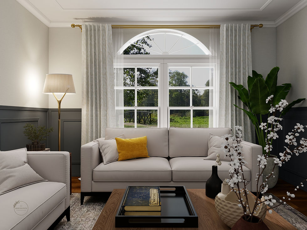
Ok this color I am completely biased to because yes, I do have it in my own house. We all have those rooms that you just cannot get the color palette correct. You find what looks like just grey on the paint chip and then you put it on your walls and BAM-you see blue, green or even purple! Mix that with the undertones of everything else that's in your room and you could be left with a big ol' mess. My house is filled with floors and countertops that have an orange undertone (you can see how Pale Oak solved my kitchen issues here). Pale Oak is a cooler gray that has a green undertone. It works so well with all the "earth toned" colors-browns, oranges, blues-which is why in my neutral styled living room it brings it all together. The deep browns, blues and even my orange toned wide planked floors now bring a relaxing calm to our crazy days.

Ok, so let's say you don't have gray walls but have a gray couch and are wondering how to incorporate color into the room. Blues, oranges and greens baby! Below is another design board I recently did for a client that has tan walls and a gray sectional. With the tan walls I stayed away from yellow because these colors do not play well together haha. I usually begin my designs by selecting patterns or colors my clients wouldn't normally select because it may be outside of their comfort zone. My design boards are a way my client can clearly see how it'll work together and 9 out of 10 go for the bolder design. If you don't see what is possible, how will you know you will like it or not?

Need some more inspiration of how well gray, blue, green and oranges play together? One of my all time favorite IG accounts is Jo Galbraith. You need to check out how beautifully she has incorporated all the mentioned colors into her home!


Guys, do not be afraid to step out of what you normally would go for. The only advice I would give against that would be for larger investment purchases like seating or hard finishes in a bathroom or kitchen (aka, countertops) because those should continue to stay classic and neutral. Its more fun switching up less expensive accessories than staring at a bold sectional you wished you didn't purchase and now have no clue how to decorate around it!
Until next time friends!
Maria
*I love hearing your thoughts and comments either here or on Facebook or IG! Follow along on my journey and see the behind the scenes for both my house and my client projects!
*Know someone who needs decorating inspiration? Share my blog with them!


Comments