Bringing Warmth to Your Home: Decorating Tips with Peach Fuzz- Pantone's Color of the Year 2024
- Maria Bowers
- Jan 11, 2024
- 4 min read

Anyone in the design industry waits for it all year long. Wonders what the major paint and color providers will select as their color of the year. It is the best way to see what trends are coming, staying and even leaving (I'm talking to you grey trend😆) and this year is no different. Or is it?
Before diving in, let's define what a trend really is: it's a current style or popular preference. Keep in mind, trends often have a cyclical nature, coming back into vogue over time. The best place to really find the latest trend before anywhere else is in fashion. Although I am sticking with my skinny jeans, that took me forever to warm up to, the flare and bell bottom jeans are all over the fashion world! I cannot believe some of the outfits I see on the younger generations since it's very much what I wore back in High School mid to late 90s.
For home design, the 80s trend of pinks and pastels seem to be creeping back in and it's reflected in almost all the companies color of the year. Sherwin Williams declared their color of the year is Upward- a nice soft pastel blue color, while Vaspar has a teal colored blue Renew Blue as theirs. HGTV by Sherwin Williams selected Persimmon which is a tangerine color. The biggest one that everyone listens to though is Pantone. If you're not familiar with Pantone, I like to think of them as the mother of all color. They best describe themselves as having "more than 10 million designers and producers around the world rely on Pantone products and services to help define, communicate and control color from inspiration to realization – leveraging advanced X-Rite technology to achieve color consistency across various materials and finishes for graphics, fashion and product design. " THEIR selection had me scratching my head and immediately going "heck no."
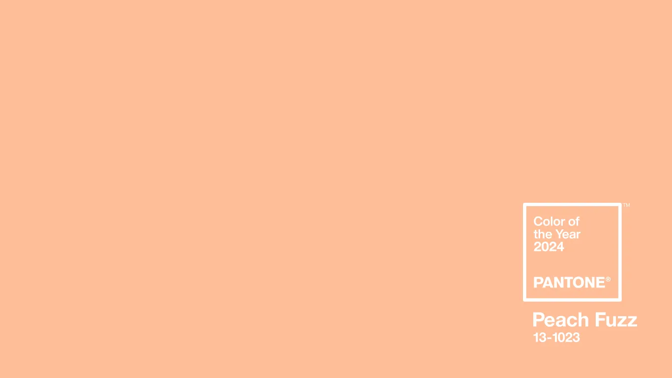
Here it is: Peach Fuzz....
If any color were to throw me right back to my teenage room it would be this one. My sister and I randomly picked a color because we got the go ahead from my parents that we could change the color (the catch was that we had to paint it😆) and this is what we settled on. Seeing this color also had me remembering all those late 80s, early 90s homes that were smothered in this color and pink and mirrors. It's a trend I think anyone my age wants to forget. But the more I look at this color, the more I realize it's a color I already use and gravitate towards when designing more feminine spaces.
Without going overboard, this color is a perfect accent to creams, greys, greens and even light blues. So I hopped into my trusted AI programs and wanted to show you some ideas "we" came up with:
With soft grey walls and furniture, the peach accents are perfect for that cozy reading corner

Don't tell me you haven't added any peach colors to your rooms when the temps cool down 🙋🏻♀️

Peach colors can reflect more like a dusty rose color and offer that feminine accent to any space.

Look at any wallpaper site and there are so many incredible designs that have peach included! These are just a small selection from Spoonflower.
Sage Green and Light Blues are great complimentary colors!

Who hasn't seen coral peach accents with light blues in any coastal home??

The more I played around with images and mixing and matching colors together the less I was cringing. There are so many variations of the peach color that we all undoubtably use it or have used it. That's why it's a trend that will last a season or two- or the year until a new color of the year is selected. The whole purpose of selecting these colors is to get people to come out of their comfort zones, embrace a color or pattern that even though may have you cringing at first, you find yourself incorporating it into your space.
She shed anyone?? 🤭

Remember, interior design is an ever-evolving art form, one that thrives on innovation and personal expression. The Color of the Year serves as a playful reminder that change can be exhilarating and transformative. Whether it's a bold accent wall, a collection of decorative pillows, or a statement piece of art, this color invites us to experiment and enliven our surroundings.
I encourage you to look around your own space. Where could this color spark joy? How might it reflect your personality or inspire a fresh perspective? The beauty of interior design lies in its ability to evolve with us, reflecting who we are and who we aspire to be. Let this Color of the Year be your muse, a catalyst for creativity and a celebration of stepping beyond the familiar.
Thank you for joining me on this colorful journey. Here's to a year of bold choices, vibrant spaces, and interior designs that tell our unique stories. Embrace the new hue, embrace the new you!
Happy designing!


Comments