A Delicious Summer Color Palette
- Maria Bowers
- Jun 24, 2022
- 5 min read


Summer is finally here! Gosh, I'm so excited to see the flowers blooming, to hear the birds chirping. It was a long, hard winter - but now it's time for play!
It's also time to talk about one of my favorite summery color combinations: the strawberry wine palette! Inspired by a simple fuchsia colored rose bush, or the color of a nice crisp rosé wine, this palette just feels like summer. When I look at this palette, whether it's in a room I've designed or in a rendering I've made, I find myself thinking about the flavors of early summer with strawberries, kiwis, and lime. It also reminds me of one of my favorite country songs, Strawberry Wine by Deana Carter, which talks about summer nights and growing older. It was the song that popped into my head while thinking up this palette!
This bright, energizing, happy palette has so many lovely associations. Fruit drinks. Smoothies. Time spent with friends. Tropical blossoms.

What I also love about using this palette in a decorating scheme is that when you see these colors all around you, you carry those associations into the rest of the year. Even when the weather turns cold and dreary, even when it's snowing outside, you can think back to the memories of summer. Those good foods. That time spent with loved ones.
Benefits of the Strawberry Wine Palette
Before I start talking about the nuts and bolts of this type of palette, I'll talk about a couple of benefits to using this palette in your home.
Playful. Do you love silly movies? Does your sense of humor shine through in every conversation that you have with friends and neighbors? Are you the life of the party? This color palette can show your fun and energetic spirit!
Dynamic and flexible. Strawberry wine pairs so well with a variety of colors, so you can swap out shades of green and other colors of pink or deep red as needed. Did you read my previous blog about the color teal? Teal and strawberry wine pair well together!
Where does this palette work?
One of the things I was most nervous about when I first started using this palette was just in finding the most appropriate use of these colors. I knew I wanted to use the palette, but where? The beauty of a strawberry wine color palette is its bold vibrant presence. This palette doesn't exactly take a back seat! I mean, who would want it to?

Of course, that same bold, vivid beauty is also what makes this palette not for everyone, and not for everywhere. It needs the right room. For the right client. You've got to have a sense of adventure when you use this palette in your home! Here's where I recommend using the strawberry wine palette:
Bedrooms
Bedrooms make great spaces for the strawberry wine palette - especially bedrooms for children. Parents sometimes worry about the long-term viability of such a bright color palette. They ask, won't I have to repaint in just a few short years? What if my child grows out of pink?
When they ask questions like this, I remind my clients that they can choose any color from the palette to paint the walls. Pink isn't the only color in the palette, after all. Suppose your palette consists of that bright fuchsia pink, a soft mellow green, and then that shade of lime. Your palette will almost certainly also include some refreshing neutrals like a rich, milky white, and maybe some shades of pink or green that are so light, they're barely there.
In other words, you can choose just about any color for the walls. You don't have to lock yourself into one particular shade. Green and white tend to be very flexible colors that can be adapted over time. Also - just being realistic here - it might not be a bad idea to repaint your child's bedroom every few years anyway. Kids can be messy! From art projects to homemade slime to soccer games played in the mud, your child's walls will get dirty with time. The time may come when you want to paint!

Playrooms
Do you want to create a sense of fun and excitement in your child's playroom? A strawberry wine palette is just what you need to create vibrancy and playfulness. Playrooms are dynamic spaces where children enjoy engaging in a variety of activities. To make the space match the purpose of the room, I recommend mixing the pink palette with white and blacks as well as greens.
Sunrooms
Sunrooms are playful spaces that match perfectly with a summer color palette like strawberry wine. One caveat for this kind of space: stick to the lighter shades. Sun rooms can be bright, hot spaces when the summer warms up. Anything you can do to keep that room cool will be beneficial in the long run! Avoid saturated colors in these spaces, as dark colors can absorb heat and make your sunroom uncomfortable during times of extreme temperatures.
Frequently Asked Questions About this Summer Color Palette
What other summer decorating colors will strawberry wine pair with?
One of the things I just love about the strawberry wine look is that it can pair well with so many other summery colors. Some suggestions:
Subtle, light blues
Teal
Champagne yellow
Kiwi green
Coral
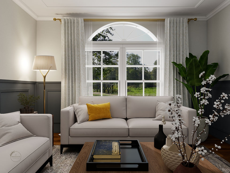
Can this color scheme be used in a living room?
You can use this color scheme in any part of the house, including in your living room! I know I suggested using this bright summer palette in a child's bedroom or in a play room, but you can use these colors in any room, as long as you enjoy this color scheme and you're feeling adventurous.
What else can I do to create a feeling of summer in my home?
In addition to the summer colors mentioned above, you can also create a sense of summer fun in your home by sprinkling summer-themed decor and accessories. Some examples:
Vase of fresh sunflowers. I love sunflowers! They exude a sense of personality and fun that adds cheer to any room.
Bowl of citrus. Nothing says summer like a bowl of citrus fruit on a table.
Gauzy curtains. Hang gauzy, see-through curtains in your room to ensure privacy while still allowing some natural light into the room.
I'm worried about using bold colors in my home. What advice can you provide?
It’s completely normal to feel hesitant when stepping out of your comfort zone and using bolder colors than you’re used to. If you'd like to use this bright summer color palette but are feeling a little sheepish, I recommend working with a professional decorator to ensure that your chosen palette is expertly applied to your home's interior. It's not that hard to create a bold color scheme in your home, but it does take some expertise to ensure the work is done tastefully. Below are some room examples. Like anything? Click on the board to go directly to my shop and purchase these items!

Have Fun With It!
Strawberry wine is a charming palette that I love to use. More than anything else,
this palette makes home interiors more fun to behold. If you're committed to enjoying yourself with your home interior and aren't sure how to make this color scheme work for you, contact a pro - like me! Contact me to get started with your home's interior decorating scheme. Click here for services!

*Don't miss out on all the amazing room palettes and design tips I have in store for you! Sign up here to receive my monthly emails!
* Come follow along! I am always sharing designs, inspiration and project updates on both client and personal projects in Facebook or Instagram!


Comments